
Key Takeaways
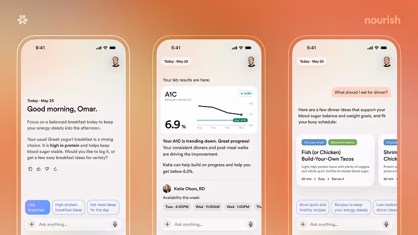
Nourish has evolved significantly as both a product and a company, and it became clear to us that the brand needed to evolve alongside it. We wanted something simple, calm, and distinctly human; a brand that could scale across many forms of care without feeling overly clinical. Our new mark, the Bloom, reflects that thinking: different parts working together in balance—a nod to guidance, care, and healthier living over time.
That same philosophy shaped the rest of the system too, from color and typography to voice and tone. As Nourish shifts toward a more proactive, guidance-forward product experience, we wanted the brand to feel calm, conversational, and grounded throughout.
Frequently Asked Questions
References
View all references
Nourish has strict sourcing policies and prioritizes primary sources, including medical organizations, governmental agencies, academic institutions, and peer-reviewed scientific journals. Learn more about our medical review process and editorial guidelines.
.jpg)